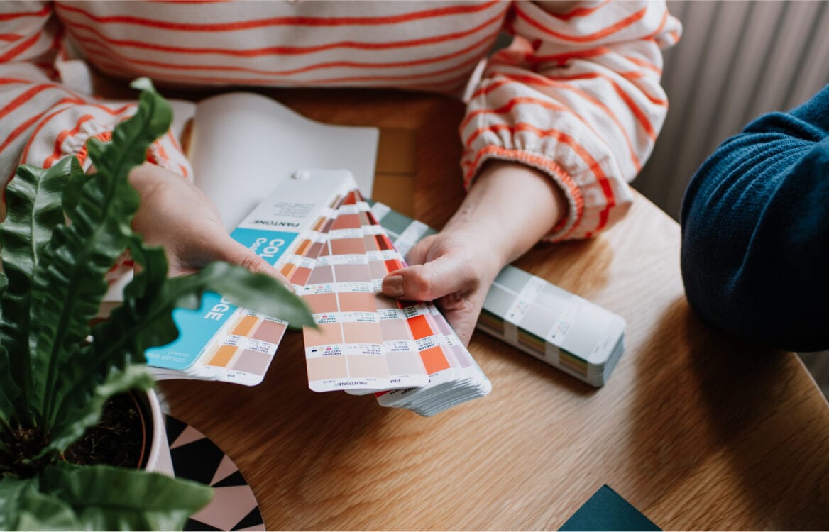
Choosing brand colours is a fundamental part of the design process and one that has the power to enhance your brand image and reinforce your brand message.
A fun way to approach colour selection is to use seasonal colour theory as a guide. Adopted by a number of design professionals to help them make decisions with their clients – from the interior designer making over a home, to the stylist planning a wardrobe, and even the makeup artist sourcing products to match skin tone – the seasons can offer so much inspiration.
Let’s consider for a moment that you’re most drawn to palettes that are bright, light, and fun. This means you’re potentially best matched to a spring colour personality. If, on the other hand, deep, earthy and natural shades are more appealing to you, then you’re likely closer to the season of autumn.
With the help of four lovely clients and their seasonal colour palettes, let me explain a little more about each brand colour personality.
Spring brand colour personality
Spring personalities are adventurous, imaginative and spontaneous, and the palette can include clear and bright shades, often with a muted look and feel. There can be a creative, dynamic and youthful element to their brand style – think bold patterns and colour pops – much like the identity I created for Studio Nikogwendo. I’m a little bit in love with the balance of soft and strong colours here. You might see rich pinks, bold aquas and bright yellows in these palettes, and I personally love the combination of coral and green.
Summer brand colour personality
Summer might surprise you as the season shouts ‘vibrant’! But you won’t find any bold shades here. No, these brand colour personalities are delicate, graceful and elegant, which you’ll see in the branding and design project I worked on for Pear & Bear Photography. The ampersand is so romantic, with light floral touches, which reminds me of hazy summer days. There’s something timeless about the colour combination, which supports Anna’s own photographic style, and with summer being her busiest season I think we’ve landed on the perfect palette.
Autumn brand colour personality
What I like most about autumn personalities is the opportunity I get to work with earthy, natural and organic colours, with an intensity that’s reflective of the world around us. These palettes are generally sunny and playful while remaining gentle and muted, something I was keen to achieve for Word by Word Storytelling. Oranges and blues pair nicely because they sit opposite each other on the colour wheel, making them complementary, and here we’ve added a softness that means the palette will sit happily at home in any season.
Winter brand colour personality
Brave, confident and impactful. I adore a winter palette, which often features clear, bright and fierce shades, however, this personality can be right at home with warm browns and greys as can be seen in this gorgeous hug of a palette for Frank+Feel. There’s something so luxurious about it, and a certain coolness brought about with the inclusion of grey and black. These particular shades offer a powerful, modern and edgy feel, while maintaining a balance with the warmer, peaceful and calming shades.
Of course, some palettes are a combination of two seasons, my own included. I’m drawn to both the romantic style of summer and the bold shades of winter, so my aim was to capture the beauty of both seasons and ensure that my brand style works all year round.
If you’re interested in learning more about branding and design, I’d love to see you in my Inside Story email community. To join, simply sign up, and you’ll receive a little gift from me!


